In the vivid world of web design, the only constant thing is change.
New technologies and techniques emerge faster than we can turn our heads and trends come and go equally fast. Most of them pose nothing more than passing fadsand gimmicks. On the other side, we have those (such as minimal design) with considerable staying power, the power to reshape the booming design landscape.
Staying on top of them holds the key to standing out and driving traffic and revenue. So, here is what the tip of the spear of creative innovation is made of.
Flat Design
Minimalism has been gaining much ground in recent years, and the latest approach it mothered is called flat design. It adheres to the fundamental principles of clean design and revolves around smart use of open space, bold color choices, and 2D illustrations.
One of the main driving forces behind this development is high emphasis Google puts on website/page loading speed. Namely, the flat design looks good without impeding functionality. It effectively does away with clutter, fosters smooth navigation, and utilizes a set of data-light elements. That is what you call a win-win.
Animated GIFs
Scaling back and showing restraint is not always a fruitful tactic. Sometimes, you need to add visual splendor and spark the imagination of visitors. This is precisely where elements such as animated GIFs come into play to save the day.
These design solutions serve as exceptional information gateways, communicating complex ideas and concepts in an instant. There is only a short window of opportunity to grab the user’s attention and GIFs manage to do it more often than not. One mistake to avoid though is going overboard and creating too much visual noise (which hurts UX).
Micro-interactions
Micro-interactions are an integral part of a modern digital journey. They enable websites to “react” to what users are doing, appearing more alive and engrossing than ever before. As such, micro-interactions inform the user and the cues they offer can take many different forms.
To name a few, we have seen everything from small icons and scroll animations popping up on the screen to beeping sounds coming out of speakers. More interactive iterations are becoming more and more popular and they reflect the direction in which UX design in general is heading.
Asymmetrical layouts
Designers are moving away from conventional grids far and wide. They are laying out elements on the screen in a different way and disrupting the order of rigid grids.In their place, there is spatial asymmetry and unevenness. The goal is not to confuse anyone, but to make things more interesting and bespoke.
This can also be done with the help of CSS grid that breaks the standard grid framework of alignment and consistency. There are also many unexpected and pushing boundaries, as well as old-school, print-inspired flavors delighting people who remember them with fondness.
Natural and organic shapes
Sharp geometrical patterns have reigned supreme for quite a while. Like it or not, they are finally making way for natural shapes, hand-drawn elements, and smooth lines. Leading web designers use them to soften the contemporary design edge andinfuse warmth.
They want to capture a spontaneous, human-like experience that resembles nature. Organic shapes to perform exceptionally well in asymmetrical and imperfect layouts we just mentioned. The end result is a more inviting and accessible digital environment.
Bold types and letterforms
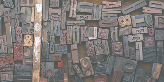
Across the board, we are witnessing the surge in the area of offbeat and eccentric types. Yes, Serif fonts are still going strong, but many are ditching them in favor of quirkier and retro-looking counterparts. For example, brands in the league of Mailchimp experiment with Cooper Black typeface for brand font.
At the same time, we see websites like Huffpost giving huge letterforms and textual content center stage. We are talking about oversized, screen-dominating messages. The kind you simply cannot miss even if you wanted to.
Conversational bots
With machine learning (ML) and artificial intelligence (AI) advancing by leaps and bounds, conversational bots are sprouting up everywhere we look. Among other things, they provide instant feedback and suggestions to users, steering them in thedirection of discovering relevant content.
Executed right, implementation of these visual helpers enhances UX and makes 24/7 support a viable proposition. Of course, the trick is not to lose a human touch in the process. Not everyone is eager to interact with a faceless effigy and you cannot blame them really.
Video content
Visual content continues to outperform other content forms. Video is in the main vehicle of this trend and this will continue moving deeper into 2019. Sifting through blocks of texts is less-than-glamorous and often tedious.
On the other hand, well-crafted videos have the power to arrest attention right awayand serve easily-digestible pieces of information. Besides, Google has paved the way for this trend with mixed search result pages that display videos alongside text-based results. Upcoming algorithm updates are only going to cement it.
Overlapping design
Last but not least, we have overlapping design elements gaining prominence. The era of card-based design with clear groupings is coming to an end and overlapping design is here to shake things up. This technique can be used to bring unexpected visual appeal to various segments of the page.
For instance, one may link subtle design elements in unconventional ways and express various nuances of brand identity. Just bear in mind that it takes time to findthe right balance, especially in the mobile-first world we live in. Thus, you might want to measure twice and cut once.
Conclusion
The internet realm seldom rests.
Every now and then, trends come around to reshape the way we design websites. If you choose to ignore them, you do so at your own peril. That being said, the point of following them is not to emulate what others are doing. They should help you flesh out unique design solutions and gain an edge in the market.
Therefore, make sure you understand the why behind trend adoption and make educated decisions after careful deliberation. Provide optimal browsing experience across devices and feel free to think outside the box. It is time to unleash your creativity and outpace the competition in 2019 and beyond.
